Ainsley Vinall discovers how the architect William Benson aimed to bring scientific ideas on light and colour to a more artistic audience.
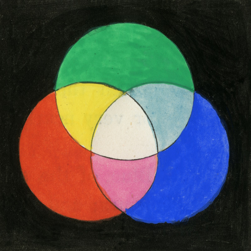
While writing captions for our latest exhibition, Light: a colourful history, I spent some time researching William Benson (1819-1903), the designer behind the wonderful colour spot charts that feature prominently in our display.
Benson was an architect rather than a scientist, so I was surprised to see how integrated he was within the scientific community. He was never elected a Fellow of the Royal Society, but corresponded with prominent Fellows, sent the Society copies of his publications, and dedicated his first book to its Secretary, George Gabriel Stokes.
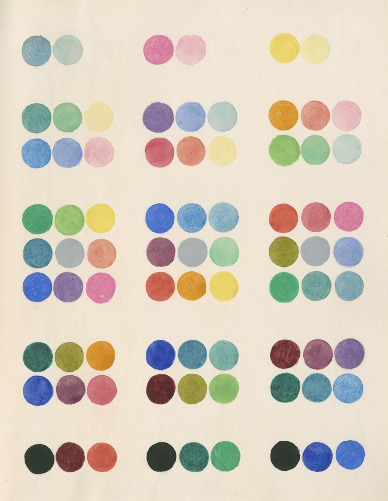 Sections of a colour cube showing Benson’s sea-green, rosy-pink and yellow colour model, from Principles of the science of colour (1868)
Benson is known almost exclusively for his two books Principles of the science of colour (1868) and Manual of the science of colour (1871), both of which aimed to bring scientific ideas on light and colour to a more artistic audience. Born in Bridgnorth in Shropshire, Benson moved to London to work as a clerk at the Metropolitan Buildings Office, later becoming an architect and decorative painter. He was likely assisted in his work by his wife Edmunda (née Bourne, 1819-1900), who had previously exhibited her own drawings at the Royal Academy. Their daughter Margaret Jane Benson went on to become one of the first female members of the Linnean Society.
In the 1860s, Benson read an article on compound colours by James Clerk Maxwell in the Philosophical Transactions of the Royal Society. Inspired by Maxwell’s colour theories, Benson decided to instruct painters and architects in the true nature of colour. After publishing his first book, he delivered a paper to the Royal Institute of British Architects explaining how colour is simply how our eyes interpret combinations of electromagnetic waves with different wavelengths. He demonstrated how red, green and blue lights combine to produce white and should be thought of as primary colours, in opposition to the traditional red, yellow and blue model.
His paper caused quite a stir amongst the architects. The decorative artist John Gregory Crace recognised ‘the great talent, great perseverance and intelligence which have been brought to bear upon the system of colour advocated by Mr. Benson, but yet I must say he has failed to convince me, that green is a primary colour and that yellow is not’. Some of the audience saw the value of Benson’s experiments, but most remained sceptical of his conclusions. Benson explained that sea-green (cyan), rosy-pink (magenta) and yellow act as primary colours when mixing paints, as they are the complementary colours of red, green and blue.
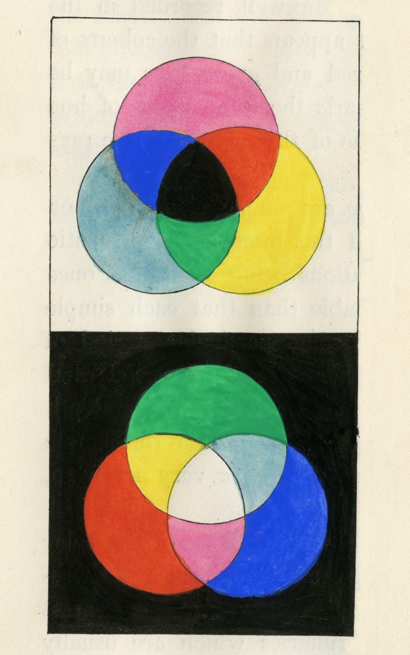 Diagram of subtractive (cyan, magenta, yellow) and additive (red, green, blue) primary colours, from Principles of the science of colour (1868)
Following the response to his lecture, Benson sent a copy of Principles of the science of colour to the Royal Society and wrote to Sir John Herschel asking for support. He explained how the book ‘has cost much research, & I hope will ultimately be successful; but as it is contrary to all the preconceived ideas of artists, I wish to enlist in its favour all those who are acquainted with the physical truth, & can speak with authority on this subject’:
Herschel responded very encouragingly, explaining how he was saddened ‘to perceive however from the remarks made on your lecture in the discussion which ensued, by one and all of the interlocutors […] displaying what I should call a crass ignorance of the whole subject of light and colours’.
The lack of acceptance of the true nature of colour caused frustrations throughout the scientific community. The mathematician Cecil James Monro wrote to James Clerk Maxwell in 1871 explaining how he wished ‘you or Benson could eradicate the insane trick of reasoning about colours as identified by their names. People seem to think that blue is blue, and that one blue is as good as another. Benson’s book I have seen (since I heard of it from you), but not read. His way of mixing by means of a prism is very happy.’
While Benson was enlisting the support of Royal Society scientists, his debate with members of the Royal Institute of British Architects raged on in a series of letters published in the architectural magazine The Builder. Following the printing of a positive review of Benson’s book, his rival John Gregory Crace wrote in to reject Benson’s guide to colour mixing. His response ended: ‘I am not aware that sea-green and rosy-pink have been overlooked in combinations of colours, or that those colours should have a special influence on the theory.’
The debate continued, with Benson patiently explaining the scientific principles of colour and Crace becoming increasingly baffled by them. At one point another architect and illustrator, James Kellaway Colling, wrote in to say that after reading Benson’s letters he had ‘only become more mystified instead of being enlightened.’ The artist Charles Edward Conder took up Benson’s side, expounding Herschel’s theories on light. Finally, Benson concluded the debate with a scientific column on how ‘waves of different periods excite different sensations of colour.’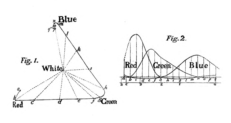 Figures from On the Science of Colour (1869), read at the Royal Institute of British Architects (Creative Commons via Hathi Trust)
Following the death of his uncle, who served as minister of Port Vale Chapel in Hertford, Benson moved out of London to take up the ministry. He seems to have lost contact with his scientific collaborators and spent the last thirty years of his life preaching as a Calvinist minister. By his death in 1903, the colour model he so enthusiastically supported had become widely accepted. The truth of his ideas is shown by the fact that almost all modern printing makes use of cyan, magenta and yellow inks, the ‘sea-green’ and ‘rosy-pink’ hues that Benson tried to persuade artists to use in the 1860s.
To discover more stories from the history of colour science, and the centuries of debate that led to our current understanding of the nature of light, visit our free exhibition in Carlton House Terrace. Light: a colourful history opens on Tuesday 5 November, and you can see it from 10am to 5pm on weekdays in the basement of the Royal Society.
