Ellen Embleton looks into the history of data visualisation, and highlights the work of Joseph Priestley, Luke Howard and Florence Nightingale.
I recently finished Caroline Criado Perez’s Invisible Women: Exposing Data Bias in a World Designed for Men. I’m late to the game with this one – the book won the Royal Society Insight Investment Science Book Prize back in 2019 – and no doubt preaching to the choir, but I loved it.
A fascinating insight into the gender data gap that persists, and the many ways in which the data we gather and use is consistently skewed towards men, the book provides examples from both public and private life. It shows how the data collected by a society often mirrors that society’s beliefs and assumptions, and explains why women are invisible in datasets today, living in a world where men are still largely considered to be the prototype human.
This inspired me to consider science history through the lens of data collection. More specifically (so I could include some nice imagery!) I focused on data visualisation, and soon found several historical data innovators to choose from. One name that kept coming up was Joseph Priestley FRS (1733-1804).
I wrote about Priestley in an earlier blogpost, and so was intrigued to come across a 1765 work of his that I was entirely unfamiliar with: A Chart of Biography. As I dug deeper, I found that it’s mentioned on his certificate of election to the Royal Society, so clearly it was a landmark work when first published:
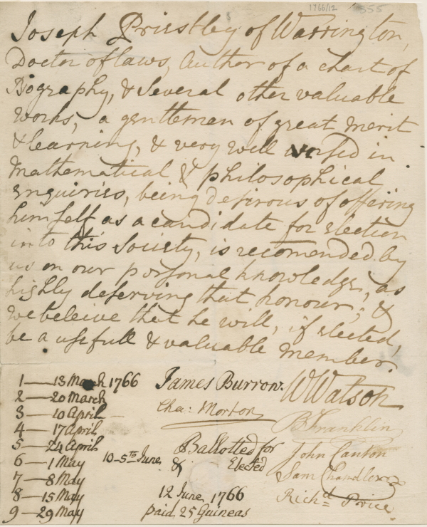
Priestley’s election certificate, which introduces him as ‘Author of a chart of Biography & several other valuable works’ (EC/1766/12)
A Chart shows the life span of over 2000 significant figures from 1200 BCE to 1765. Rather than just listing names and years of birth and death, Priestley plotted them on a timeline. The horizontal axis showed dates, while the vertical groupings organised people according to the type of person they were – politician, artist, statesman, warrior and so on – and bars were used to represent lifespans, with dots where someone’s life dates were uncertain:
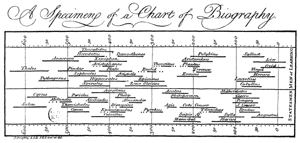
A sample from Priestley’s Chart of Biography, 1765 (Wikimedia Commons)
Though not particularly artistic, this was strikingly innovative for the mid-eighteenth century, when even basic bar or line graphs were not yet commonplace in data presentation. Perhaps unsurprisingly though, Priestley’s ‘greats’ from history are overwhelmingly male and largely from the classical and Western pantheon – two data biases reflecting Priestley’s own education and the world in which he moved.
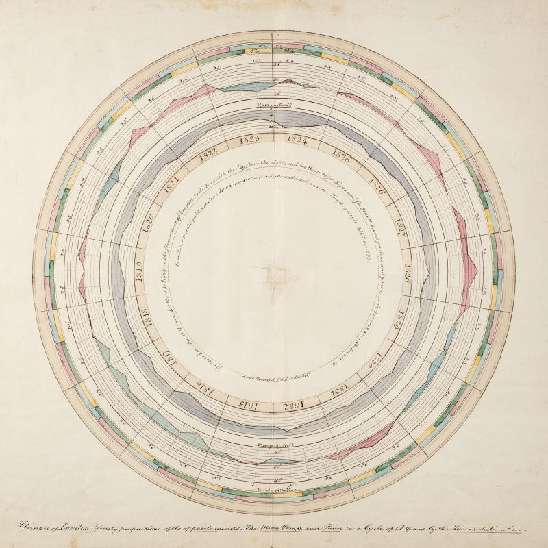
Later, perhaps more visually pleasing examples are the meteorological graphs of Luke Howard FRS (1772-1864) from our Archived Papers series. These detail certain weather conditions between the years 1815 and 1832 in London:
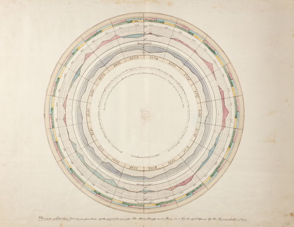
Diagram 3 from Howard’s, ‘On the proportions of the prevailing winds, mean temperature and depth of rains, in the climate of London’ (AP/25/10)
The innermost circle lists the year, then (moving outwards) the average rain depth, average temperature and wind direction. It’s not clear why Howard presented his information in this unusual circular format. However, given the quote from Genesis inscribed on the graph, one might suppose it had a religious undertone, with the symmetry of a circle in Christianity heavily weighted and often used to symbolise heaven.
We know that women often worked behind the scenes on scientific illustration. However, I was keen to find an example of a woman grounded in data presentation, and was pleased to discover that ‘the lady with the lamp’, Florence Nightingale (1820-1910), is now celebrated both as a talented mathematician and as a pioneer of data visualisation.
Like Mary Seacole (1805-1881), another famous figure from nursing history, Nightingale is perhaps best remembered for her healthcare work during the Crimean War. There is good evidence that she was a data journalist in support of this career: on her arrival at the British military hospital in Turkey in 1856, she found such poor hygiene practice that it was leading to further infections, diseases, and deaths. She sent this message home, urging the government to help in creating solutions to these practical problems with the facilities in Crimea. It seems Nightingale used graphics in her pleas to Parliament, most famously these ‘Coxcombs’:
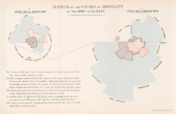
Coxcombs from Nightingale’s ‘Notes on matters affecting the health, efficiency, and hospital administration of the British Army: founded chiefly on the experience of the late war’. (Credit: Wellcome Collection)
In this diagram, Nightingale uses areas to represent the data she had gathered on death rates in relation to sanitation and cleanliness in hospitals, instead of the length of the radial lines which would have been more commonplace. I found a great explanation of the diagram in this article, which breaks it down as follows:
‘The circle on the right has 12 sectors going clockwise representing the first 12 months of the war. The circle on the left is the second 12 months. The superimposed dark shapes show the monthly death rates. The diagram illustrates how the Sanitary Commission, sent out in the middle of the war, dramatically reduced the death rate.’
Not only was Nightingale a pioneering medical reformer, in other words, but also one with a keen eye on how to win an argument by marshalling facts in a comprehensible and visually arresting way. Indeed, these three examples all have an innovative style and, in the case of the latter two, an artistic flair to them that would render them very much at home on our Picture Library.
Though not without its biases, gendered or otherwise, data is important and, as I’m sure the scientists listed here would agree, good data enables us to deal with some of the most pressing everyday issues we face. When it looks nice, well, that’s just a bonus.